What if I told you as of today I’m taking 30% of your website traffic and handing it directly to your competitors? Would you be mad? Wouldn’t you want to do everything possible to make sure this didn’t happen?
Something tells me the answer is yes, but for some reason, website owners do not seem all too concerned with Google’s latest Mobile Search Algorithm change that aims to do exactly what I described above if your website is not mobile-friendly.
Before we get carried away… let’s make sure we are clear on a few things
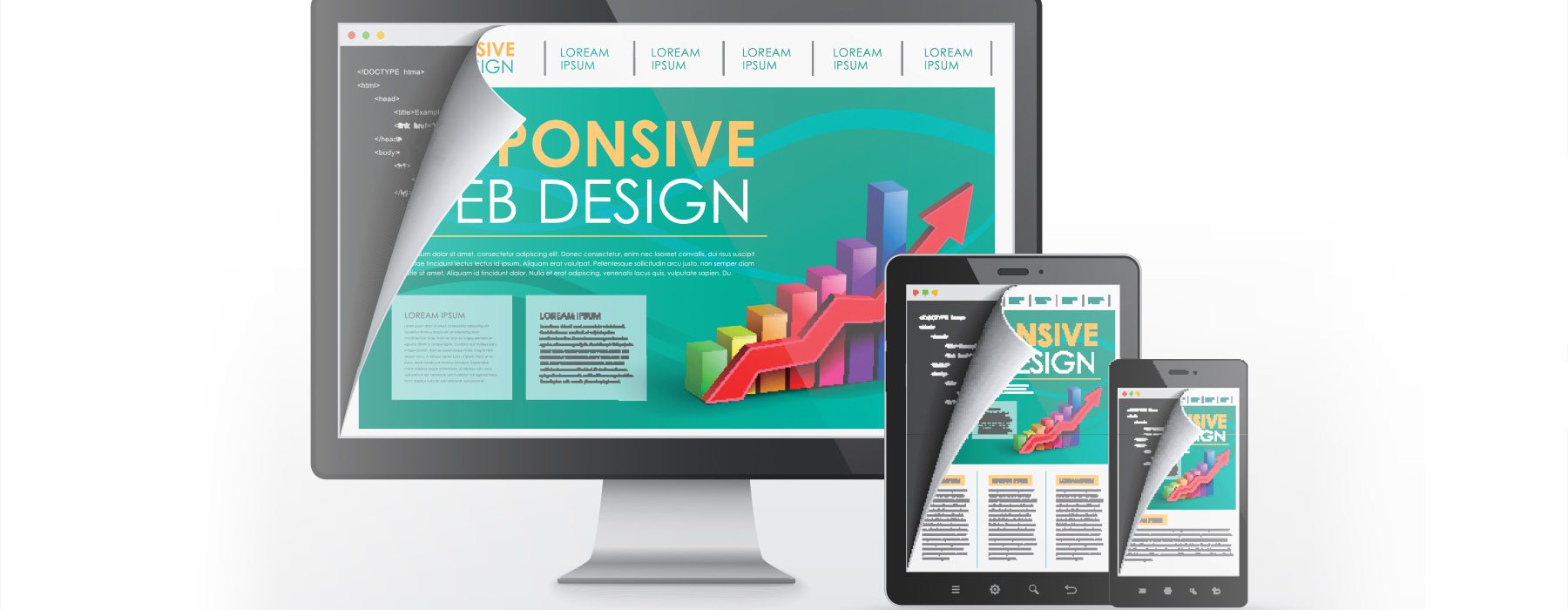
Exactly what is Responsive Web Design?
Responsive design refers to websites that provide an optimal viewing experience for the user by allowing the website to readjust and reposition the layout to function and flow easily on any device, albeit a desktop computer, tablet, or smartphone. Responsive functionality can come in the form of rearranging the page layout, changing the way or what content is presented, and special features designed to be used specifically from a smartphone or tablet such as a mobile menu.
The most significant feature, even the most novice website aficionado is likely to notice is that the website adjusts fluidly when the browser size is changed or if the site is viewed on varying screens and devices. Research demonstrates that responsively designed websites have a myriad of benefits to businesses. By creating a website experience that makes it easy for visitors to navigate and interact, businesses have an advantage over competitors. Developing a site with responsive features also allows websites owners to build one site and then deploy that site to all devices, saving both time and cost.
Responsive Design and Mobile Friendliness – A Must for 2015
Most Mobile-friendly websites are a great example of responsive design. If your business does not provide a mobile-friendly experience, you are losing out on a valuable segment of customers.
In 2014, search marketing company iAcquire determined:
- 70% of mobile searches result in action on websites within an hour.
- Of sites accessed via a mobile device, 40% of people conduct the search on tablets, while 60% search on their phones.
- Furthermore, 40% of mobile users will choose another result if it is not mobile friendly.
By providing a website that is responsive to the various ways a user can access information, such as on their mobile device, your business has an edge in capturing the attention and consumer power of tech-savvy customers. Visitors also enjoy the fact that their browsing experience on your site is consistent regardless of the device used to access your website.
Note: While responsive websites are created with a “mobile first” approach in mind, be aware “responsive” does not automatically mean “mobile friendly.”
Responsive Design and the Search Algorithm
A search algorithm sounds like a complex concept but it’s really very simple. Search algorithms are a series of steps or procedures search engines such as Google implement to compare websites against one another when a user performs a search. Based on the search term you use, the search engine generates and awards specific placement to your web page in the search results based on its relevancy to the search term entered. For example, if you run a legal practice in Nashville, TN Google will use it’s search algorithm to determine how relevant your web pages are to search users looking for a Nashville, TN attorney and rank your website accordingly. Naturally, every business wants to be among the first results to appear for relevant keyword searches, and algorithms incorporate a myriad factors that influence search result rankings.
This month… today… April 21 2015, Google is transitioning to a new algorithm that will shake up site rankings considerably. They are now updating their search algorithm to include mobile friendliness as a significant ranking factor for your website. Websites that are optimized well and responsive should pass Google’s mobile-friendly test, but there are millions of websites that will not.
A recent report by Portent revealed that 40% of top websites in the world reviewed for mobile-friendliness failed to pass the test. This included websites launched within the last five years, such as healthcare.gov or American Apparel.
Google Makes a Decree
It is important for your business to have a responsively designed site for many reasons; but perhaps the most urgent call to reform is occurring with Google’s transition to a search algorithm that rewards mobile-friendly sites with better internal scores, leading to overall higher ranking results. Google is an undisputed vanguard in the world of search engines, holding 67.5% of the U.S. overall search market and 87.1% of the U.S. mobile search market. Therefore, their decision to incorporate mobile friendliness into its ranking algorithms beginning April 21 is not one to take lightly.
In an SEO driven business culture, staying within a “passing” range of Google’s algorithm results is practically a requirement. If your company fears failing Google’s standards, they provide several useful tools to help ease your mind. One valuable tool allows you to remove the mystery of “is it mobile-friendly or isn’t it” by using Google’s Mobile Friendly Test Tool. This will provide you with a breakdown of your site’s strengths and weaknesses, as well as suggested actions you can take to bring your site closer to a passing score. This is a great step to take on your current site, as well as throughout the process of improving your site’s mobile friendliness.
Failing Google’s Mobile-Friendliness Guidelines
Google uses very firm language in stating that it will “punish” websites that fail to earn mobile friendly status. You can be certain that Google’s bold stance indicates that mobile friendliness is a component of website design and ranking results that will have long term importance to search optimization and user experience.
While you will be punished with lower rankings in search results, having a site that’s not mobile friendly does not doom you to the eternal depths of buried rankings. Once you have made adjustments to the design of your web pages, you can re-submit your site for Google to re-index it, and restore your higher ranking placement.
Also it is worth mentioning that lower rankings most likely will only effective your site’s ranking when the search is performed on a mobile device. Desktop users often care little whether a site is mobile-friendly and therefore, desktop results will not be affected by the change just yet. It is rumored that an entirely separate search algorithm is being developed for mobile search results. This will continue to allow Google to provide better search results to mobile users and improve their search experience. Of course, if your site is not mobile-friendly that’s not good news, but Google is in business to keep its search users happy first and foremost.
A Deeper Issue to Consider
Mobile friendliness is not the only change to Google’s algorithm, and standard search optimization techniques remain important. The odds are good that if your site does not currently meet mobile friendliness standards, then it’s likely not optimized as well as it could be, either. It’s probably been quite some time since you considered upgrading your site, or perhaps it’s something you’ve pushed to the back burner so you could address other important business matters. Given the fact not being mobile-friendly can actually hurt your bottom line, consider the shift toward developing a mobile friendly web presence as soon as possible. Use this as a reason to review your site and insure it is findable in the search engines for years to come. Inaction, on average, will cost you a minimum of 20-35% of your website visitors as of today. You should do everything in your power to not willingly hand over 1/3 of your website traffic to your competitors.
Key Takeaways
You most likely found this article because you were searching for more information about why responsive web design is important as well as the importance of having a mobile-friendly website in 2015.
If you own a website and rely on it for generating revenue either directly or indirectly for your business you should consider how Google’s change might be affecting your bottom line. Here are some of the key points to remember about what you’ve just read:
- Having a responsive website does not inherently absolve your site from failing the mobile-friendly test. We have seen responsive sites fail too.
- If you don’t know whether your site is mobile-friendly or not, stop speculating and take the Mobile Friendly Test.
- 40% of websites rated to be the top websites in the world failed the test.
- Mobile users, on average make up anywhere from 20-35% of your total traffic. If your site is not mobile-friendly you are literally handing 1/3 of your traffic directly to your competitors.
- Many sites that fail the mobile-friendly benchmark often have many other underlying optimization issues or have been neglected for quite some time.
As a business owner you should be master of your domain… literally. The thought of losing 1/3 of your traffic should be compelling enough to take action and put a plan in place to not only convert your site to responsive but also to examine how you can better utilize your website as a driving force behind generating new leads for your business. We would love to help. If interested in setting up a free marketing assessment call, click below to schedule today.


