“Rebranding” has become the decade’s buzzword because so many companies see its benefits. Not every business does it well, though. There is a certain amount of risk that goes into rebranding. It is more than just a marketing strategy designed to stay current and competitive.
For some, rebranding is an attempt to move past a negative image. Philip Morris is an excellent example of this type of rebranding. Philip Morris was once the largest manufacturer of cigarettes. In 2001, they started to rebrand to The Altria Group. The goal was to insulate the company from political pressures associated with the sale of cigarettes.
Rebranding isn’t a bad thing, though. It can help a brand redefine its image to correspond with shifting business goals. Companies do it all the time and for positive reasons. Consider some brands that did it well recently.
Dunkin’ Donuts Becomes Dunkin’
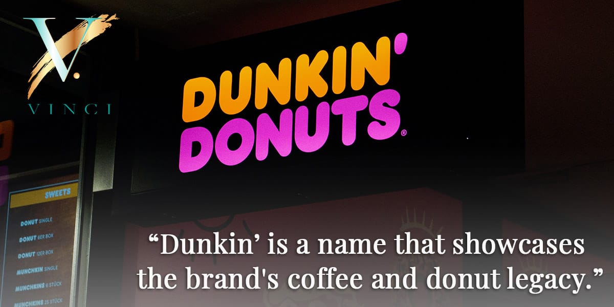
Dunkin’ Donuts started its rebranding with an announcement of its intent in 2018. It was a colossal step for a company that had built its 70-year reputation around donuts.
Dunkin’ Donuts has grown beyond the donut, though. Today, their franchises are more on-the-go coffee shops that offer many varieties of donuts than the old-style donut store. Dunkin’ Donuts even has a retail brand of coffee available.
The goal of rebranding was to maintain the company’s legacy but expand its image. The name change reflects that goal eloquently. Dunkin’ is a name that showcases the brand’s coffee and donut legacy.
The new company logo reflects the change but still respects the image the company has proudly built since the 1950s.
How Dunkin’ benefited from rebranding:
- The company removed a limiting factor in its brand name but did it in a way that didn’t sacrifice what people recognized about it. The color palette and Dunkin image are associated with the brand.
- The new brand image allows the company to compete more in the beverage market.
- Rebranding modernized a dated image without stripping it of its heritage.
Dunkin’ took the rebrand to their stores with remodels and used it to cover all aspects of their marketing, including social media channels and packing designs. It changed quickly once the planning was complete and without too much fanfare.
Tupperware
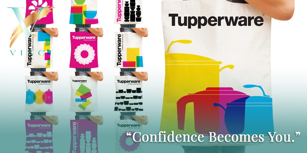
Although Tupperware has a solid and iconic image, it is somewhat of a relic of the 1970s. So in 2018, the company decided it was time to rebrand and modernize it to meet the current market. Rebranding allowed Tupperware to shed outdated associations and refresh its image to satisfy the modern culinary experience.
Tupperware was once a sign of empowerment for women. The company wanted to expand on that concept to make it more inclusive. Rebranding started with a tagline:
Confidence Becomes You.
It was a way to play on the past while leveraging a place in the modern world. The brand kept the name the same because it does have such a strong association in the market it built. Tupperware is the pioneer for storage containers. They didn’t want to lose that appeal.
The rebrand focuses on messaging and visual identity. They updated their color palette to bright colors and added the new tagline to all the marketing assets. Tupperware updated its internal message, as well, with a new Book of Confidence for associates.
How Tupperware benefited from rebranding:
- It kept the name to utilize the company’s reputation as a pioneer in its market.
- It used colors and messages to create a bold, modern voice that would reach people of all ages and genders.
- It modernized the internal message as well to empower associates with the new modern voice.
Through rebranding, Tupperware kept its connection to the past but made it more appealing to younger generations.
Animal Planet

Animal Planet began its rebranding in the Fall of 2018. The goal was global recognition across many platforms. The company was already available in 205 countries but needed a way to connect its marketing to a global audience using multiple viewing devices. The solution was a remake of the iconic Animal Planet logo.
The current logo of an elephant with a globe did have recognition. The company wanted to make use of that as they created an innovative new look. They liked the use of the elephant, too, because it was a majestic animal and represented their image well.
The result was a modern design that incorporated an elephant jumping over the inference of a globe. The underside of the logo was round to represent the globe. By having the elephant jumping, Animal Planet wanted to capture a sense of energy and joy.
How Animal Planet benefited from rebranding:
- The brand focused its rebranding effort on the logo, minimizing the impact for viewers.
- Besides being aesthetically pleasing, the logo translates well across different countries and cultures.
- The logo gives the brand a memorable global mark for marketing assets and products.
Animal Planet’s new logo gave them an icon that worked well on television and mobile devices.
Rebranding Trends for 2023
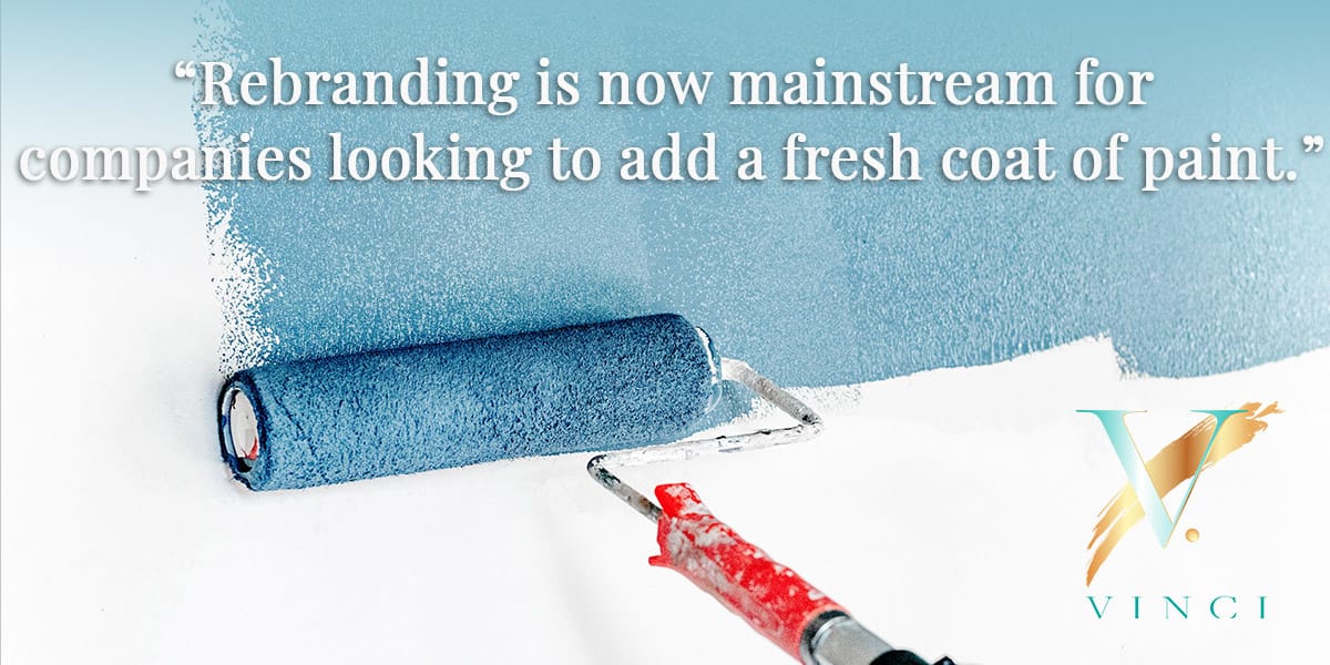
Rebranding is now mainstream for companies looking to add a fresh coat of paint. However, rebranding isn’t limited to large corporations. It can be a way for small or medium-sized businesses to stimulate growth, especially in an economic shift like the world is currently seeing. Many economists are suggesting the chances of a recession in the near future.
Shape-Shifting Logos
By 2023, companies will be looking for any way to draw the attention of consumers who want to cut back. That may mean simple messaging changes to stay competitive, including updated shape-shifting logos.
A brand can have a master logo for the website and simpler icons for social media. An excellent example of this is a logo like Chanel uses. It has the name in a large font and then an icon for a connected C on top.
It is a design that offers flexibility. They can drop the “C” in the name and use the icon, for instance. Or, it can drop the name altogether and still have easy recognition from the icon.
Minimalism
Using minimalism, brands may symbolize current concerns such as global financial issues and the environment. That typically means shifting the color palette to just one or two colors. You can expand on that by using more negative space on the website and in marketing campaigns. Less is more for 2023.
Having an expert on hand will ensure it goes smoothly regardless of the reason for rebranding. At Vinci, we work with companies of all sizes to help them rebrand with cutting-edge website and logo designs. So reach out today and request a consultation for site update recommendations.